 View Details
 View Details
 View Details
 View Details
 View Details
 View Details
 View Details
 View Details

| Service | Deliverables | Links | Status |
|---|---|---|---|
| Landing Page Design | Website and Application | Website | In Development |
| Mobile App Design | |||
| Interface Design | |||
| User Experience Design |
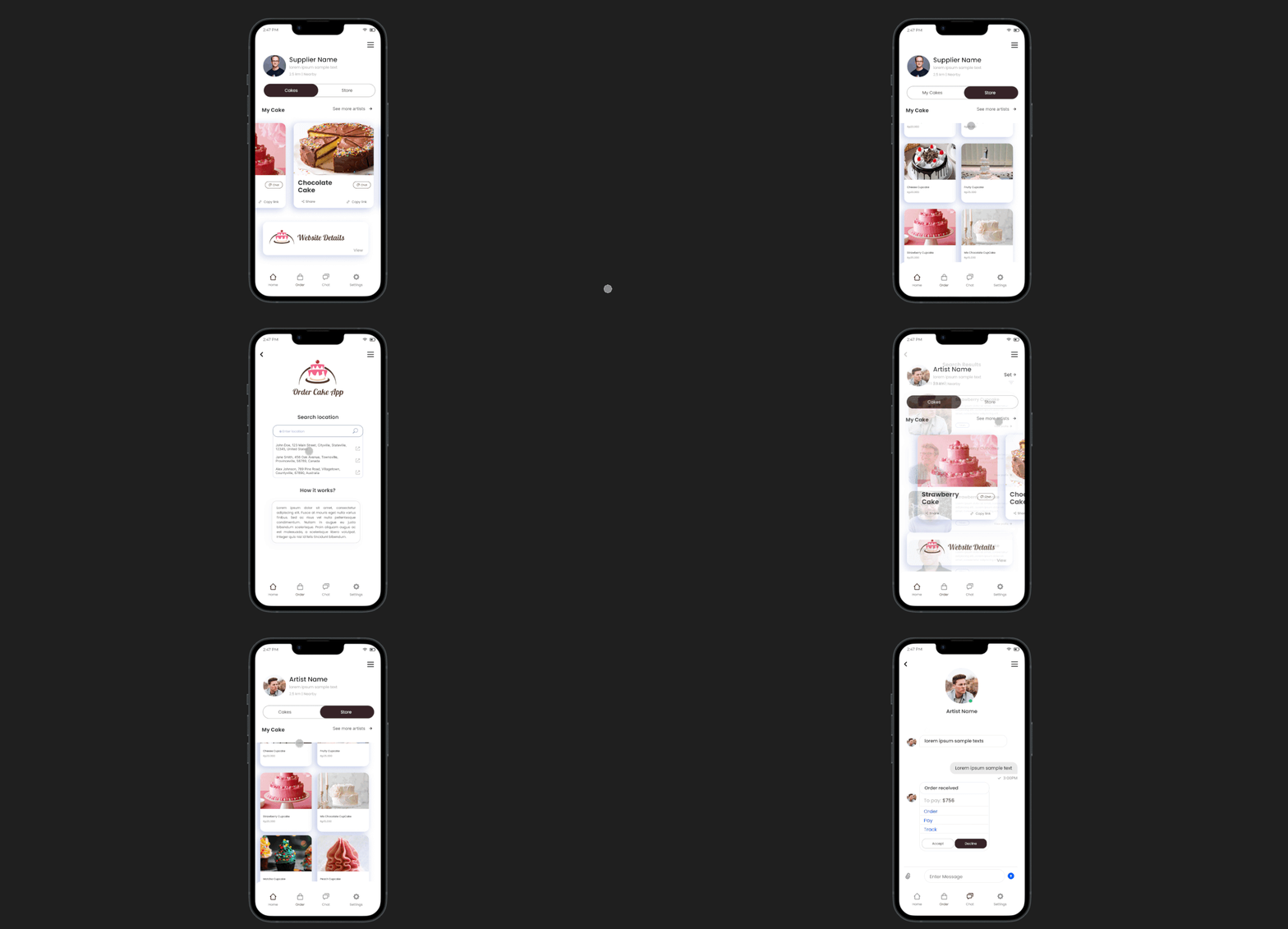
OrderCake is a white-label app designed for cake bakers and enthusiasts. It offers a user-friendly interface, customizable features, and a seamless experience for designing, ordering, and enjoying cakes. This versatile platform aims to revolutionize the cake industry by catering to the unique needs of both professionals and consumers, making the entire process enjoyable and efficient.
Recognizing the challenges in engaging clients to design and order cakes through both our website and app, we've strategically devised a solution. Our approach involves the creation of a neutral and user-friendly app, designed to captivate a broader audience within the cake industry. This innovative solution aims to streamline the process, making it more accessible and engaging for clients to unleash their creativity and seamlessly place cake orders. By implementing this neutral app, we anticipate a substantial increase in client participation, fostering a more dynamic and interactive experience in the ever-evolving world of cake design and ordering.
Ocaye Ltd.
In our continuous efforts to elevate the user experience, we're excited to unveil a groundbreaking feature—Enhanced Collaborative Design. This innovative addition empowers clients to collaborate seamlessly in real-time, enabling them to co-create unique cake designs effortlessly.
I am actively collaborating with my manager to seamlessly transform their vision into reality. Despite the ongoing development phase of the project, I am engaged in a collective effort with other skilled Flutter programmers. Together, we are working cohesively to enhance and refine the project, ensuring that every aspect aligns with the envisioned idea. This collaborative approach not only promotes a dynamic and efficient workflow but also contributes to the overall success and innovation of the project.
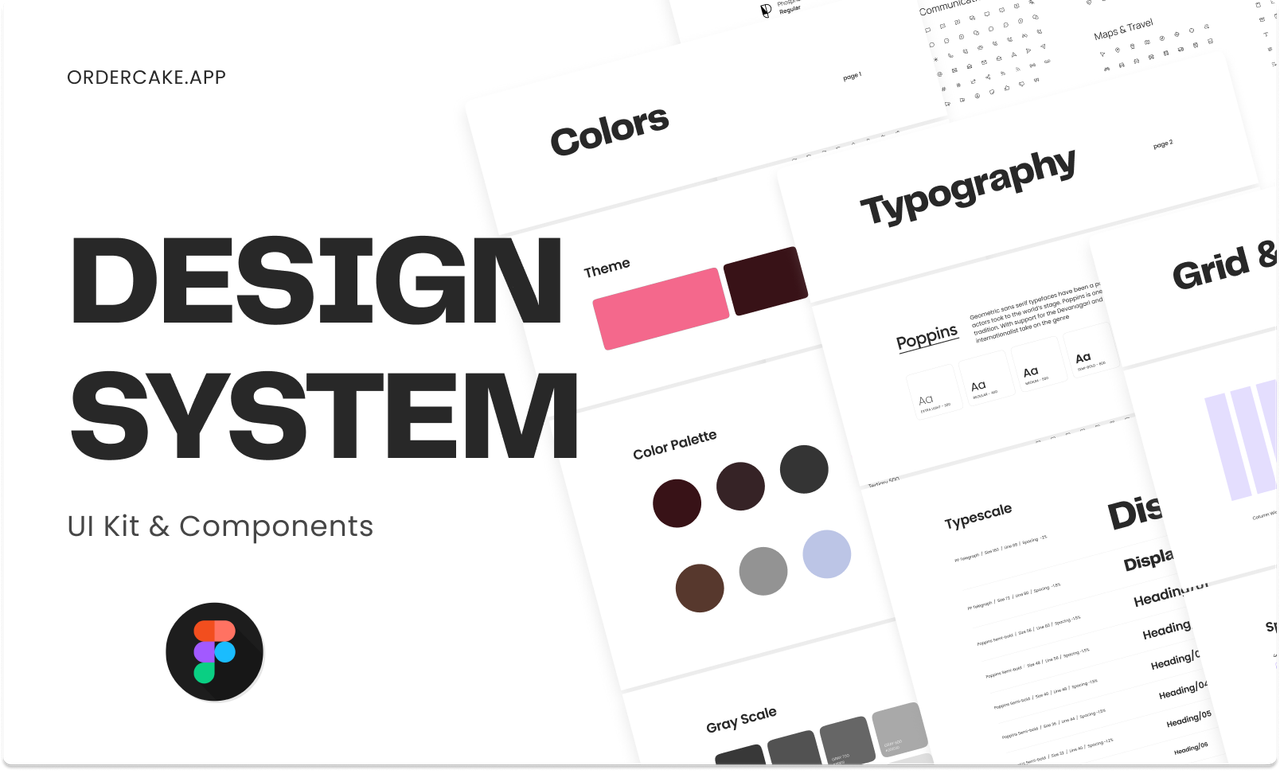
I participated in a team discussion to outline the app's process and features. Collaboratively, we deliberated on the intricate details to ensure a comprehensive approach. Our goal was to enhance functionality and user experience, paving the way for a successful and innovative application.
I often seek design inspiration for unfamiliar projects. The concept of a white-label app is novel to me, and exploring its possibilities adds an exciting dimension to my design exploration.
In the majority of my projects, I typically craft low-fidelity designs to elucidate the user process effectively. These simplified representations serve as a concise yet comprehensive means of conveying the intended user journey and system interactions.
Transitioning from low fidelity, I elevate my design approach to high fidelity, incorporating detailed visual elements, polished aesthetics, and precise interactions. This refined stage ensures a more accurate representation of the final product, offering a comprehensive and visually compelling user experience.
I've learned the importance of meticulously paying attention to every detail of a project. Additionally, I've honed the skill of integrating research and seeking design inspiration, particularly for unfamiliar projects. This approach ensures a comprehensive understanding and a well-rounded execution of design concepts.

| Service | Deliverables | Links | Status |
|---|---|---|---|
| Landing Page Design | Website | Project Link | In Development |
| Interface Design | |||
| User Experience Design | |||
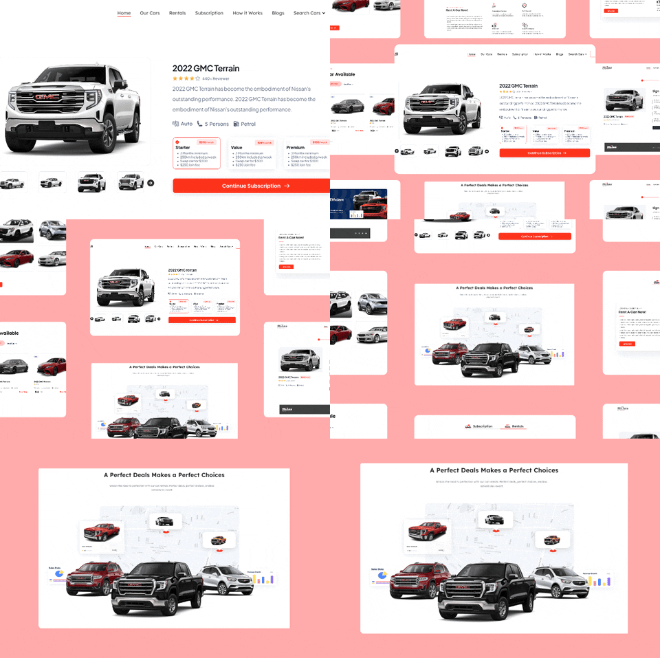
The primary target demographic of this website is comprised of individuals who are interested in either renting a car for short-term use or subscribing to a monthly payment plan to access and utilize a vehicle over an extended period. These individuals may include travelers seeking temporary transportation solutions, urban dwellers looking for convenient mobility options without the commitment of car ownership, or professionals in need of flexible transportation arrangements. By catering to the needs of this diverse audience, our platform aims to provide a seamless and efficient process for securing rental vehicles or subscription-based car services, ensuring maximum convenience and satisfaction for our users.
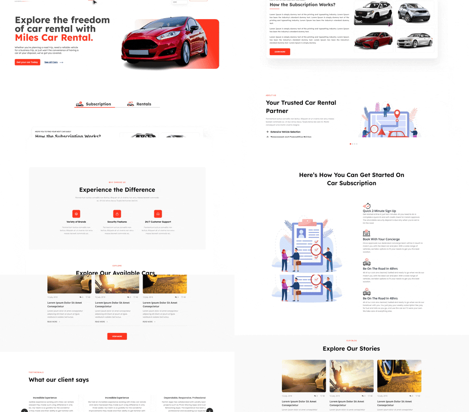
Challenges:
1. Designing an intuitive and visually appealing user interface that simplifies the car rental or subscription process.
2. Ensuring a seamless user experience across different devices and screen sizes.
3. Incorporating features that enhance user engagement and satisfaction, such as interactive vehicle browsing and easy booking/payment options.
Solutions:
1. Conduct thorough user research to understand preferences and pain points, informing the design process.
2. Prioritize simplicity and clarity in the interface design, with clear navigation and prominent call-to-action buttons.
3. Utilize responsive design principles to ensure optimal viewing and interaction experiences on desktops, tablets, and smartphones.
4. Implement user-friendly features like filtering options, live chat support, and personalized recommendations to enhance usability and satisfaction.
Ocaye Ltd.
This approach streamlines communication and decision-making among diverse stakeholders in the design process. By utilizing real-time collaboration tools and regular workshops, we ensure every voice is heard and ideas are quickly iterated upon. With clear roles and a culture of openness to feedback, we foster efficiency and innovation in our design practices.
By fostering teamwork and cross-disciplinary collaboration, we enhance our website's user experience and service offerings. Through open communication and partnership with external stakeholders, we continually refine our platform to meet evolving customer needs and market demands.
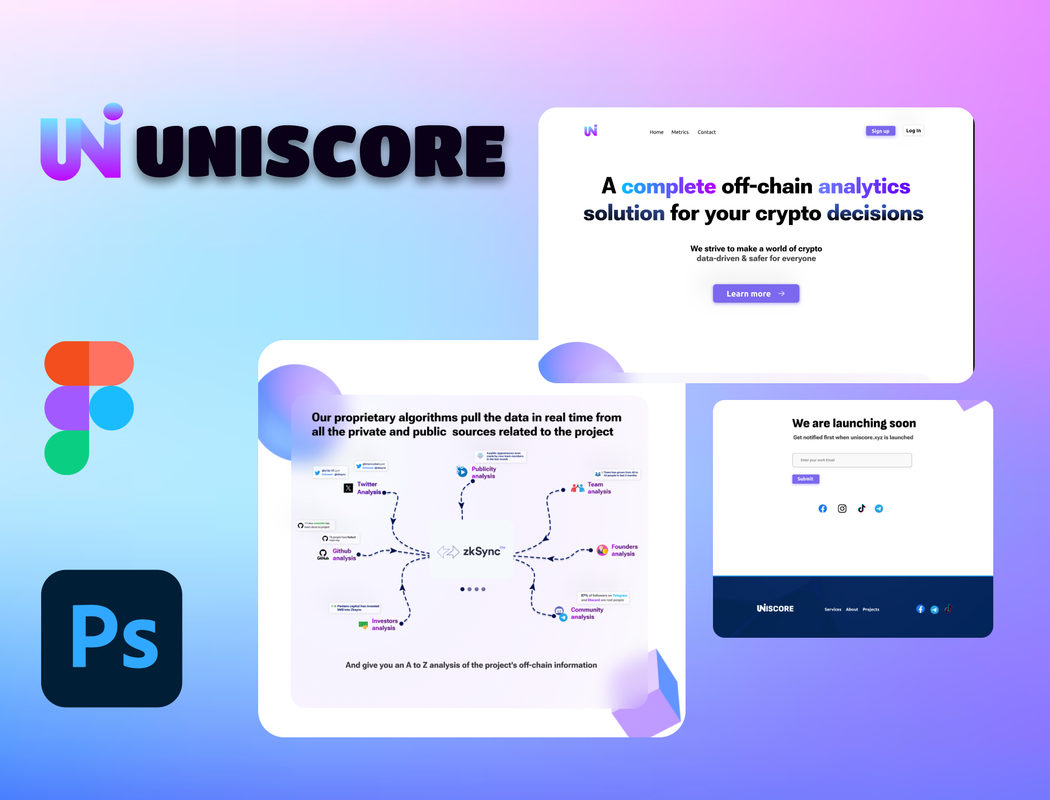
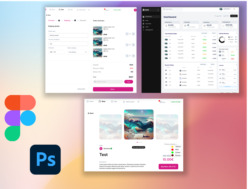
I participated in a team discussion to outline the Website's process and features. Collaboratively, we deliberated on the intricate details to ensure a comprehensive approach. Our goal was to enhance functionality and user experience, paving the way for a successful and innovative application.
In the majority of my projects, I typically craft low-fidelity designs to elucidate the user process effectively. These simplified representations serve as a concise yet comprehensive means of conveying the intended user journey and system interactions.
Transitioning from low fidelity, I elevate my design approach to high fidelity, incorporating detailed visual elements, polished aesthetics, and precise interactions. This refined stage ensures a more accurate representation of the final product, offering a comprehensive and visually compelling user experience.
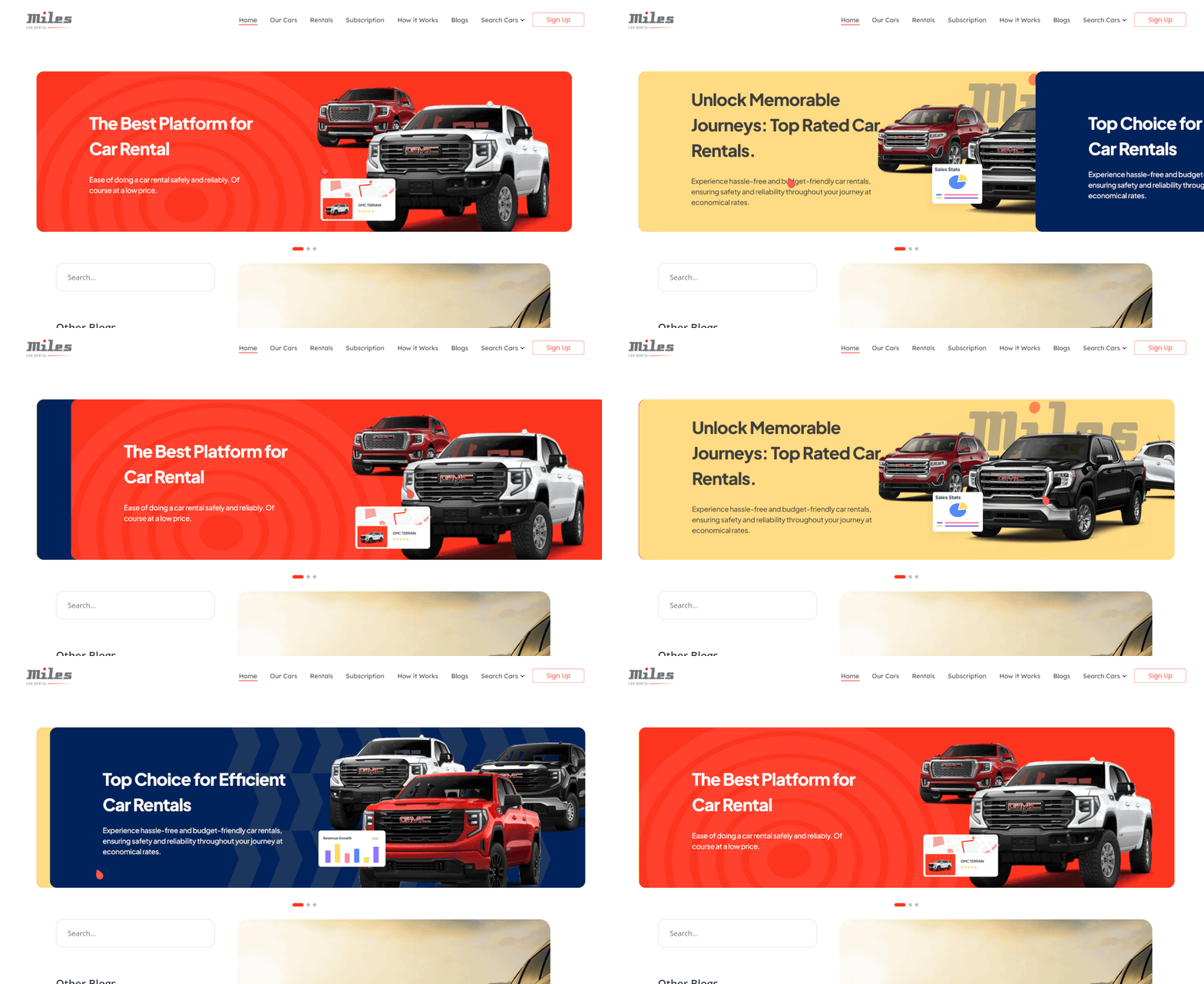
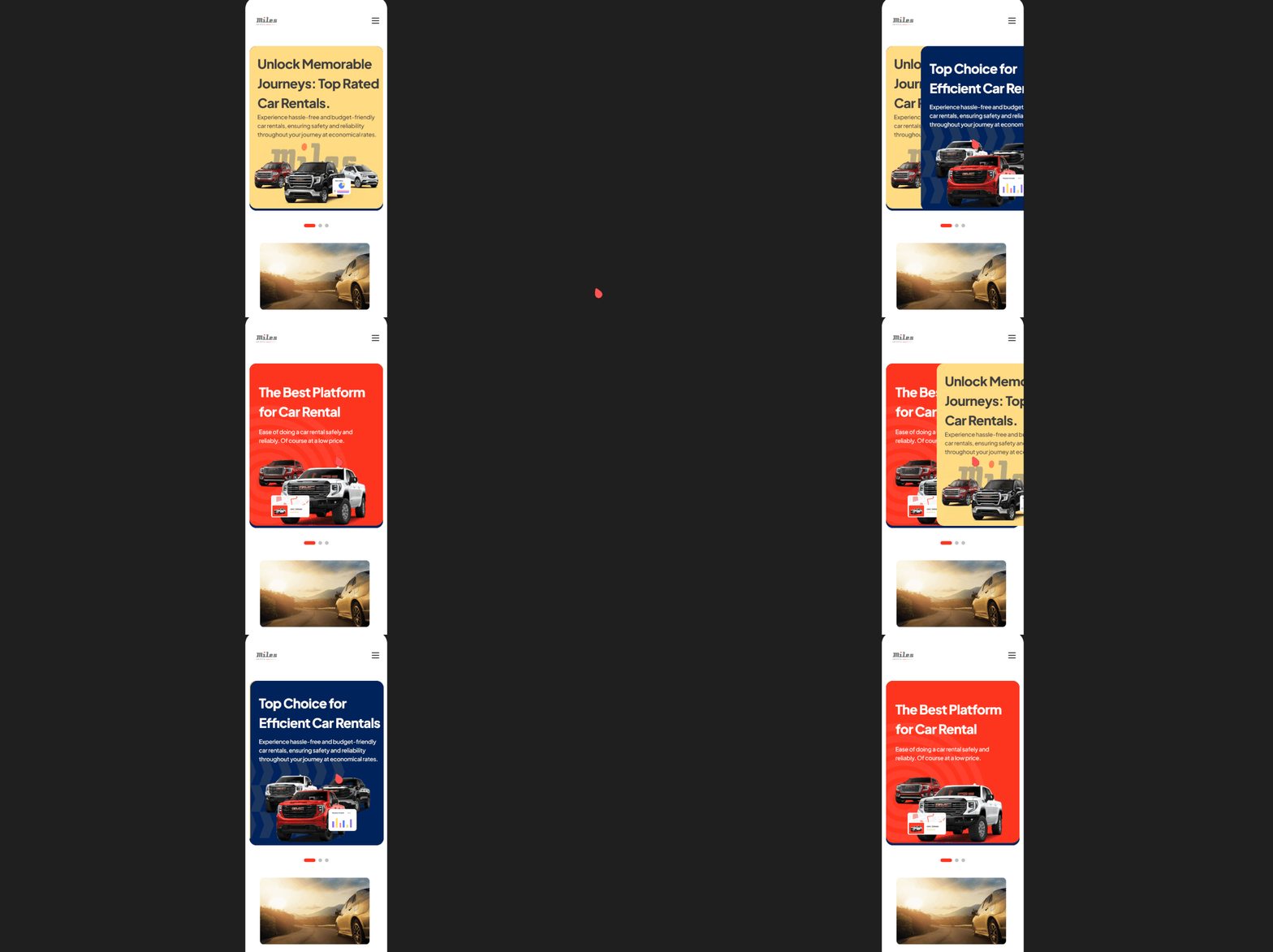
As part of the design process, I've created a prototype to demonstrate the banner interaction on our car rental website. In this prototype, users can see how the banner smoothly transitions between different promotional offers or important announcements. By clicking on the banner, users can access more details or take action, such as booking a car or exploring available subscription p lans. This interactive feature enhances user engagement and f acilitates seamless navigation, providing a more intuitive and dyna mic browsing experience for our website visitors.
I've gained insights into the significance of ensuring user-friendly website design, prioritizing clarity and simplicity to enhance the user experience. Additionally, I've recognized the importance of maintaining consistency in branding elements such as color schemes, banners, and logos, as they contribute to a cohesive and professional appearance across the platform.



| Service | Deliverables | Links | Status |
|---|---|---|---|
| Mobile App Design | Application | Project Link | In Development |
| Interface Design | |||
| User Experience Design | |||
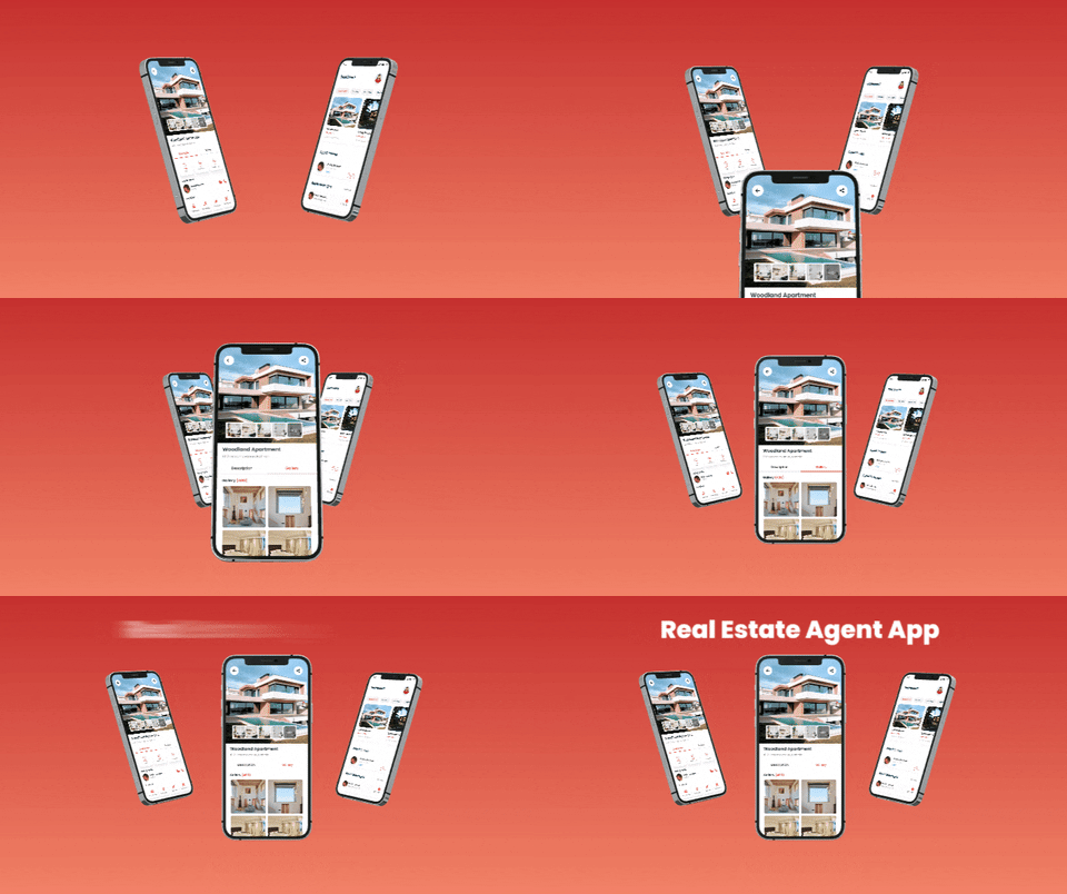
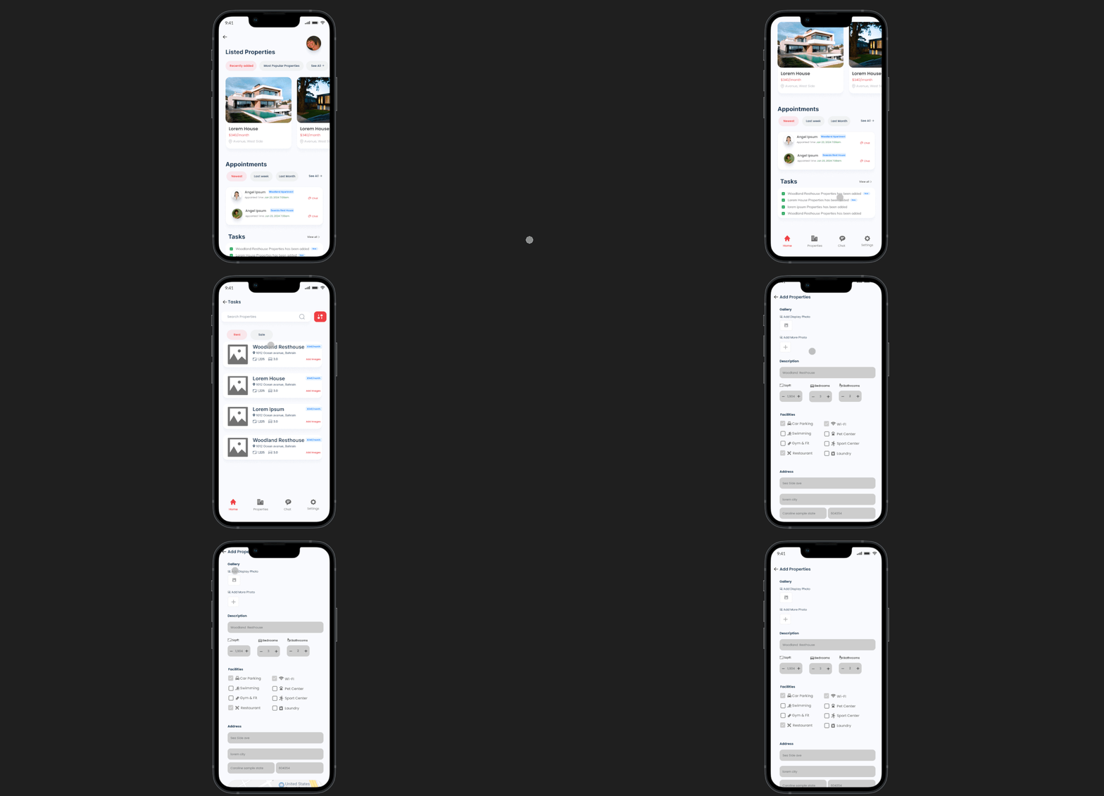
The audience for Agent One app primarily includes real estate agents and property managers who want a white-label solution to efficiently manage and showcase their properties, as well as potential buyers or renters seeking to schedule visits or meetings with agents.
With Agent One, real estate agents and property managers have the flexibility to set their own schedules according to their availability, ensuring efficient management of appointments and property viewings.
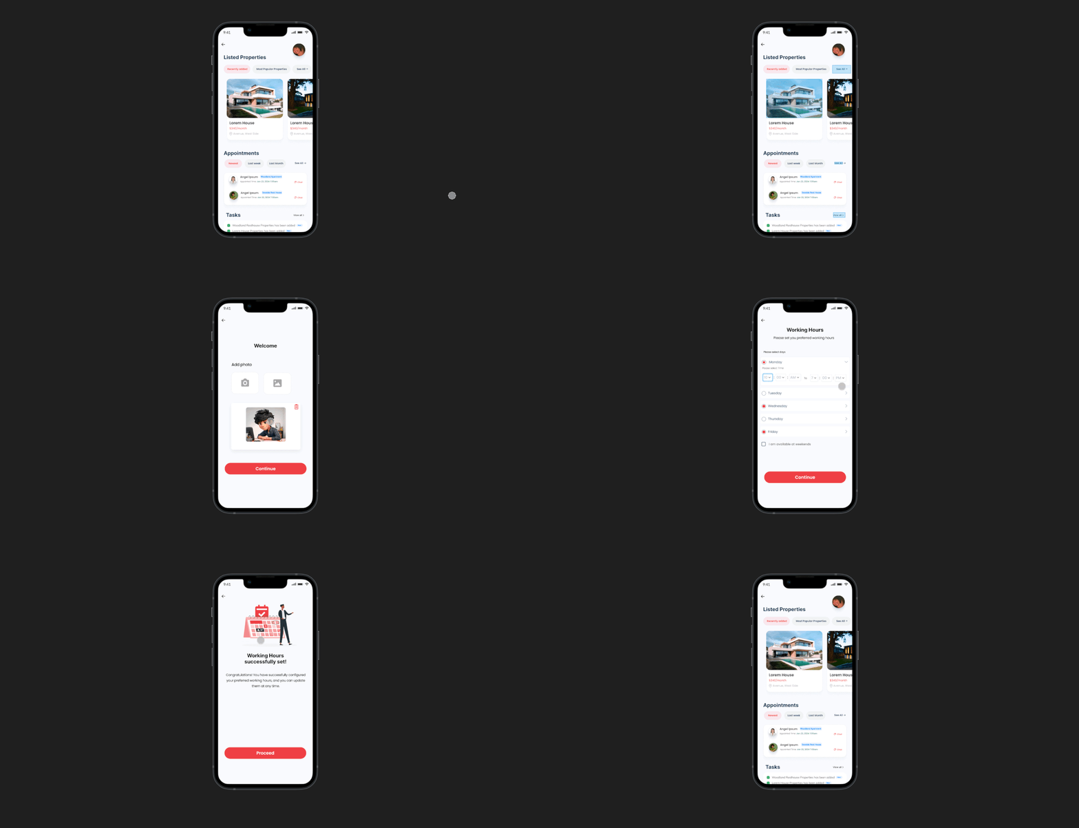
Agents using Agent One can effortlessly manage their appointments, allowing them to prioritize and organize meetings with potential buyers or renters, streamlining the property viewing process.
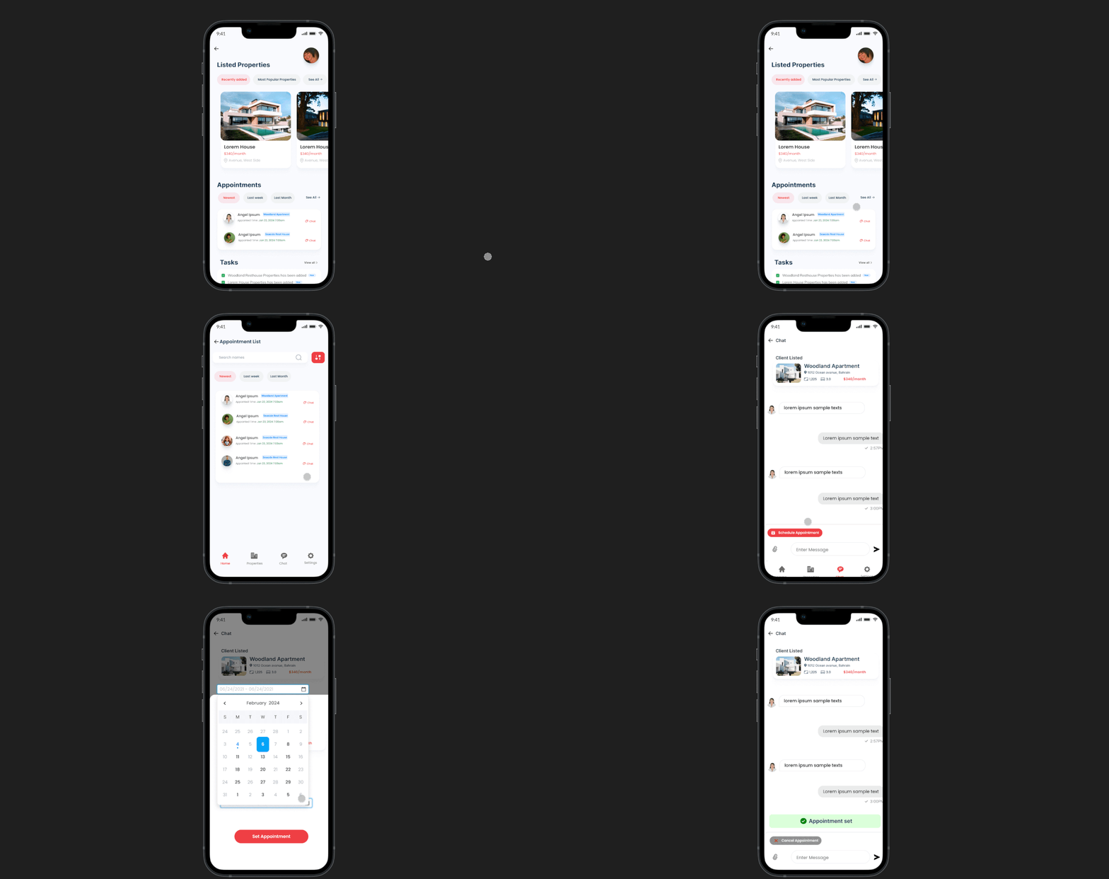
Through Agent One's user-friendly interface, agents can easily add new properties to their portfolio, providing detailed information and features to attract potential clients.
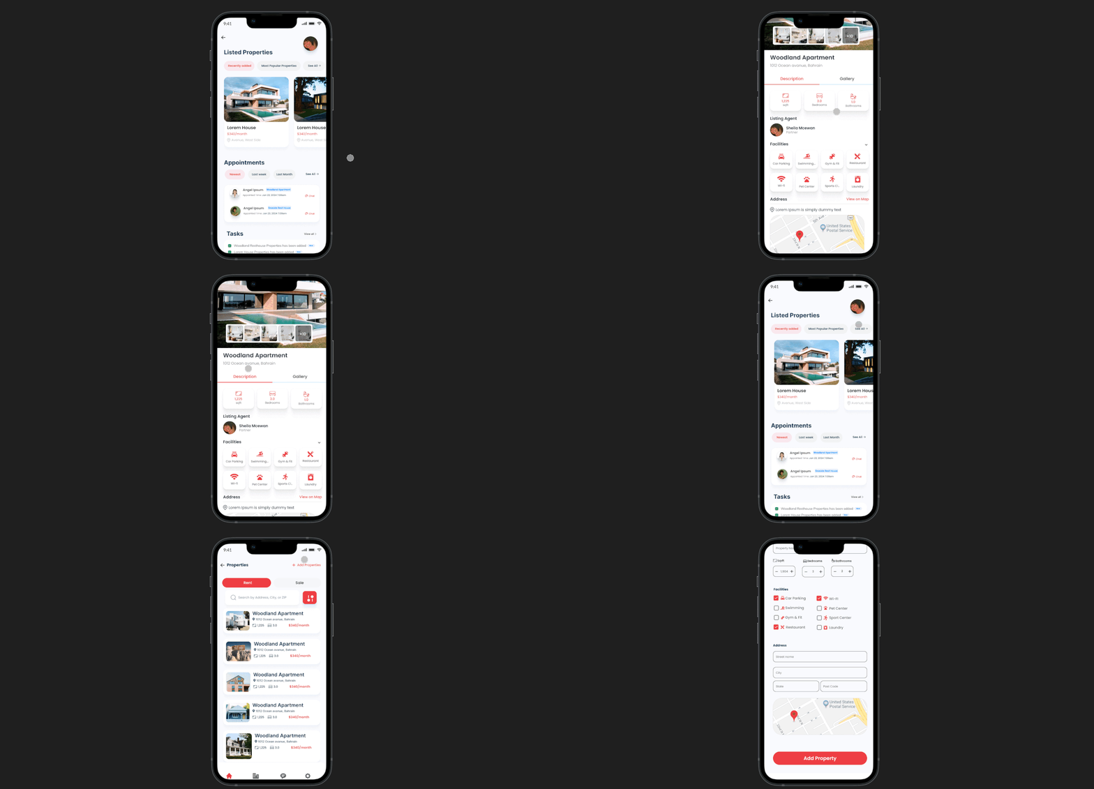
Enhance property listings with captivating visuals. Agents can effortlessly upload images to showcase properties, ensuring they stand out to potential clients browsing the app.
Challenges:
Agents may find it challenging to navigate
through the app's user interface and design
, particularly when managing appointments a
nd property listings. Complex navigation or
cluttered layouts can lead to confusion and in
efficiency, hindering the user experience.
Solutions:
To address this challenge, I implemented a user-centric
design approach. I conducted thorough user research to
understand the needs and pain points of real estate agents
using the app. Based on this research, we simplified the
navigation structure, ensuring that essential features such
as scheduling appointments and managing property listings
are easily accessible.
Ocaye Ltd.
Our solution simplifies navigation and enhances visual clarity, empowering users to efficiently manage appointm ents and property listings. Guided by user feedback, we' ve crafted an intuitive experience, complemented by feat ures like voice memos for seamless organization and prod uctivity.
Our approach prioritizes user feedback, resulting in streaml ined navigation and enhanced visual clarity. With features like voice memos for effortless organization, our solution empo wers users to efficiently manage appointments and property li stings, ensuring a seamless and productive experience.
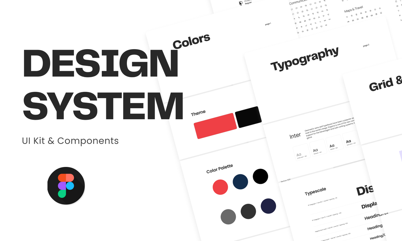
I participated in a team discussion to outline the app's process and features. Collaboratively, we deliberated on the intricate details to ensure a comprehensive approach. Our goal was to enhance functionality and user experience, paving the way for a successful and innovative application.
In the majority of my projects, I typically craft low-fidelity designs to elucidate the user process effectively. These simplified representations serve as a concise yet comprehensive means of conveying the intended user journey and system interactions.
Transitioning from low fidelity, I elevate my design approach to high fidelity, incorporating detailed visual elements, polished aesthetics, and precise interactions. This refined stage ensures a more accurate representation of the final product, offering a comprehensive and visually compelling user experience.
I have crafted a prototype aimed at illustrating the user's journey comprehensively, thereby facilitating developer understanding of the intended functionality. This prototype serves as a tangible representation of the user experience, offering developers valuable insights into the flow and intricacies of the design. Through interactive demonstrations and visualizations, developers gain a clear understanding of user interactions, system responses, and overall user interface dynamics.
I've gained valuable insights into the significance of user-centric design, emphasizing the importance of simplicity and clarity in app development. Ensuring that the app is easy to understand for users enhances their overall experience and encourages engagement. Additionally, maintaining consistent colors throughout the app fosters visual cohesion, reinforcing brand identity and improving usability.


| Service | Deliverables | Links | Status |
|---|---|---|---|
| Mobile App Design | Application | Project Link | Published |
| Interface Design | |||
| User Experience Design | |||
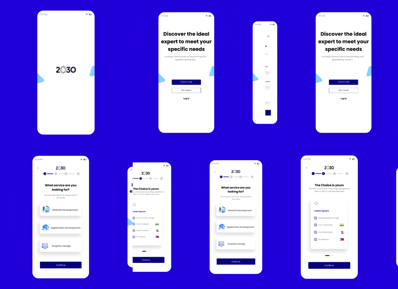
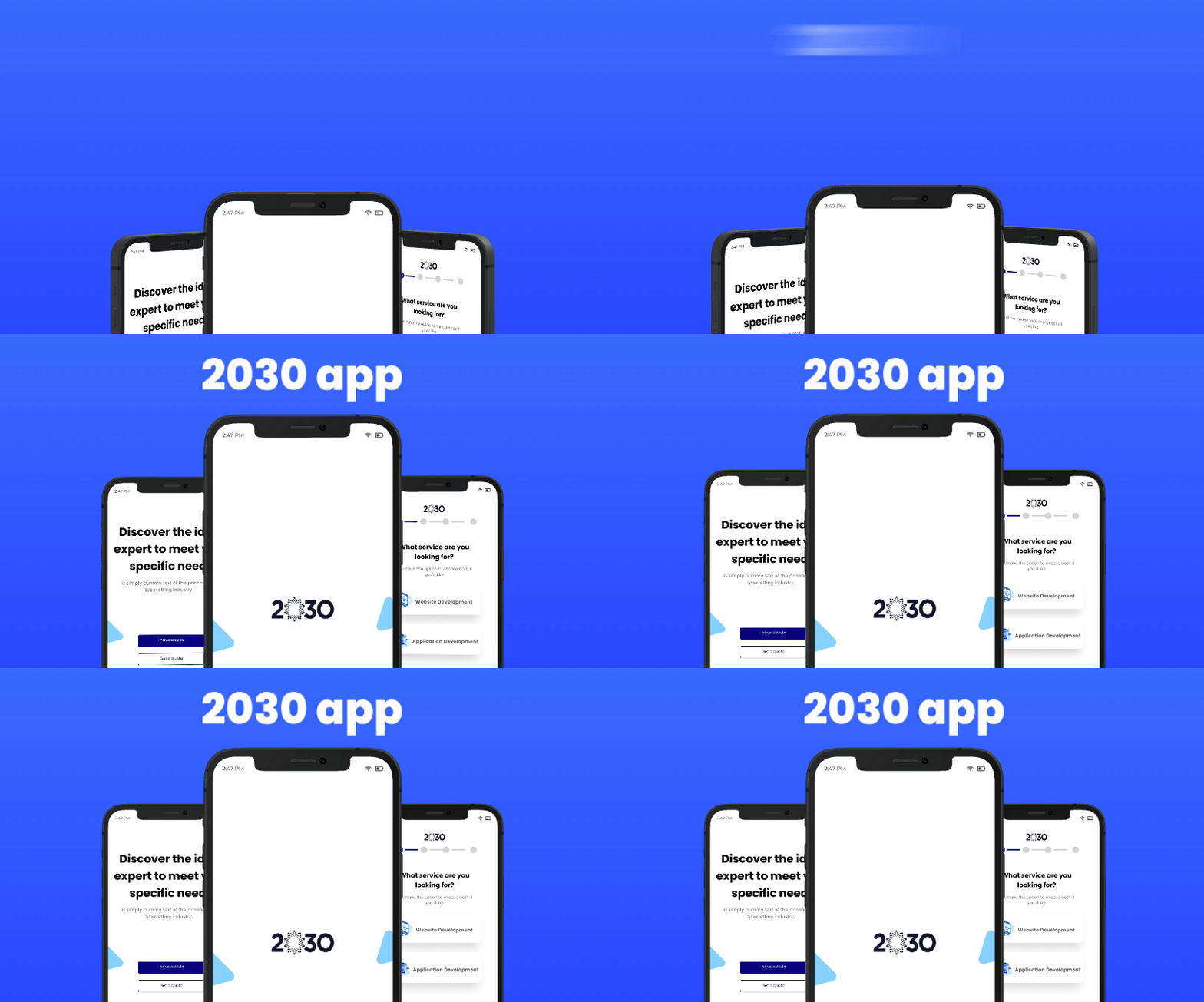
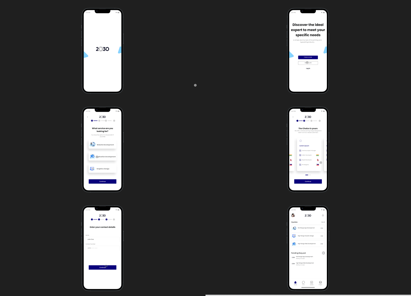
The app caters to individuals seeking to bring their projects to life, connecting them with skilled professionals for web and app develo pment. The unwavering dedication to excellence sets us apart, guaranteeing that your digita l ventures soar to new heights of innovation and triumph.
Our app empowers users to tailor their expe rience by selecting the exact services they need a quote for. Whether it's web design, mobile app developm ent, or any other digital service, clients can specify their requirements, ensuring they receive a personalized quote tailored to their project's unique needs.
Challenges:
Our primary challenge lies in streamlining the process
for users to connect with us effortlessly, whether it's
to obtain a quote or avail our services. We aim to eli
minate any barriers or complexities that might hinder
users from reaching out, ensuring a seamless and user-
friendly experience.
Solutions:
To address this challenge, we have developed a user-c
entric app that simplifies the entire process. Through
intuitive navigation, users can easily find the specific
services they require. Additionally, our app features
an integrated messaging system, allowing users to commun
icate with us directly for inquiries or to discuss their
project needs. This solution not only enhances user conv
enience but also fosters a direct and efficient line of
communication between our company and our valued clients.
Ocaye Ltd.
Our app revolutionizes collaborative design by providing a dynamic platform where users can seamlessly collaborate in real-time, streamlining the design process and fostering creativity.
Experience innovation in action with our app, where teams collaborate effortlessly to bring ideas to life, leveraging collective expertise and creativity to drive meaningful outcomes.
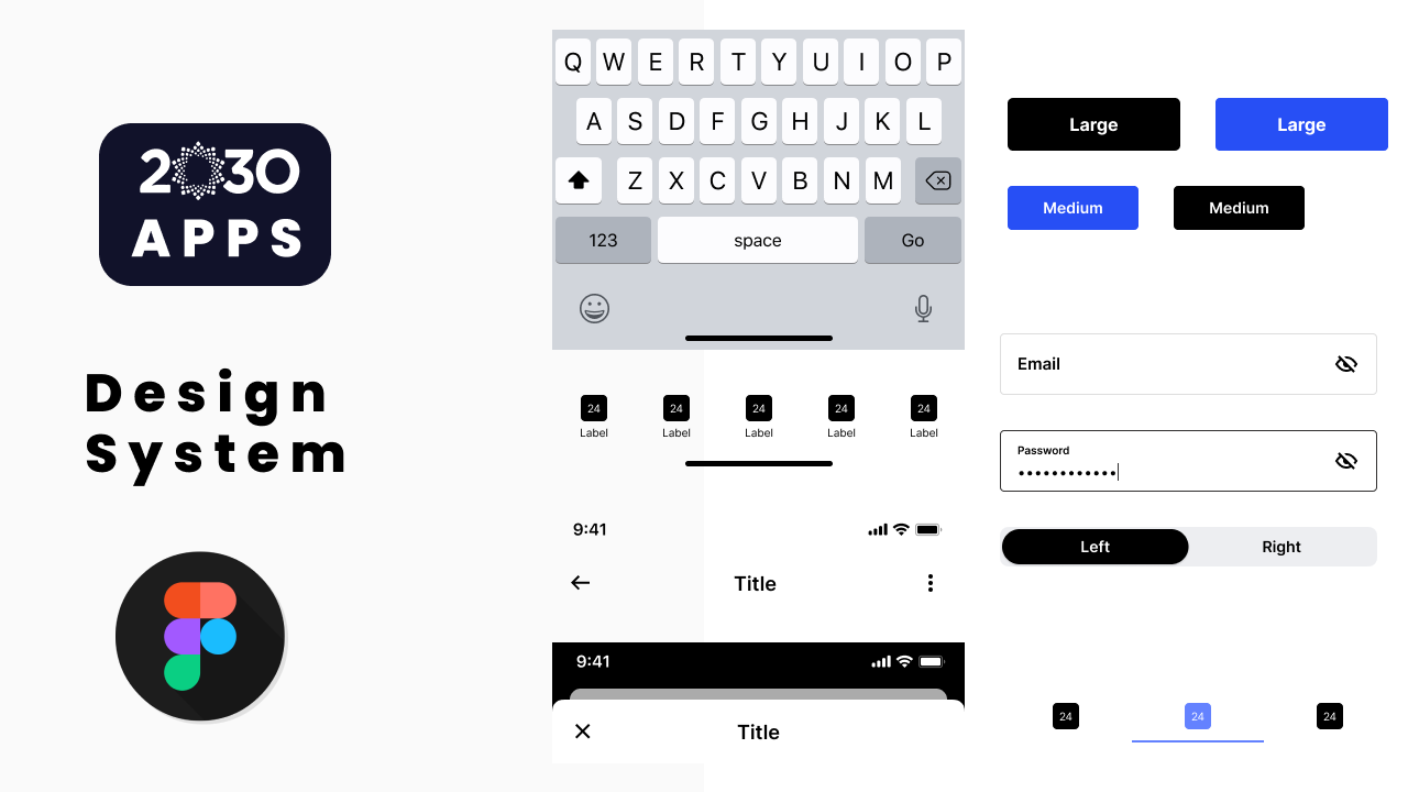
I participated in a team discussion to outline the app's process and features. Collaboratively, we deliberated on the intricate details to ensure a comprehensive approach. Our goal was to enhance functionality and user experience, paving the way for a successful and innovative application.
In the majority of my projects, I typically craft low-fidelity designs to elucidate the user process effectively. These simplified representations serve as a concise yet comprehensive means of conveying the intended user journey and system interactions.
Transitioning from low fidelity, I elevate my design approach to high fidelity, incorporating detailed visual elements, polished aesthetics, and precise interactions. This refined stage ensures a more accurate representation of the final product, offering a comprehensive and visually compelling user experience.
As part of the design process, I've created a prototype to demonstrate the banner interaction on our car rental website. In this prototype, users can see how the banner smoothly transitions between different promotional offers or important announcements. By clicking on the banner, users can access more details or take action, such as booking a car or exploring available subscription p lans. This interactive feature enhances user engagement and f acilitates seamless navigation, providing a more intuitive and dyna mic browsing experience for our website visitors.
I've gained a deep understanding of the significance of simplified design in ensuring user comprehension and ease of navigation within the app. By prioritizing simplicity, we enhance user experience, making it more intuitive for users to understand the app's processes and functionalities, ultimately leading to higher user satisfaction and engagement.


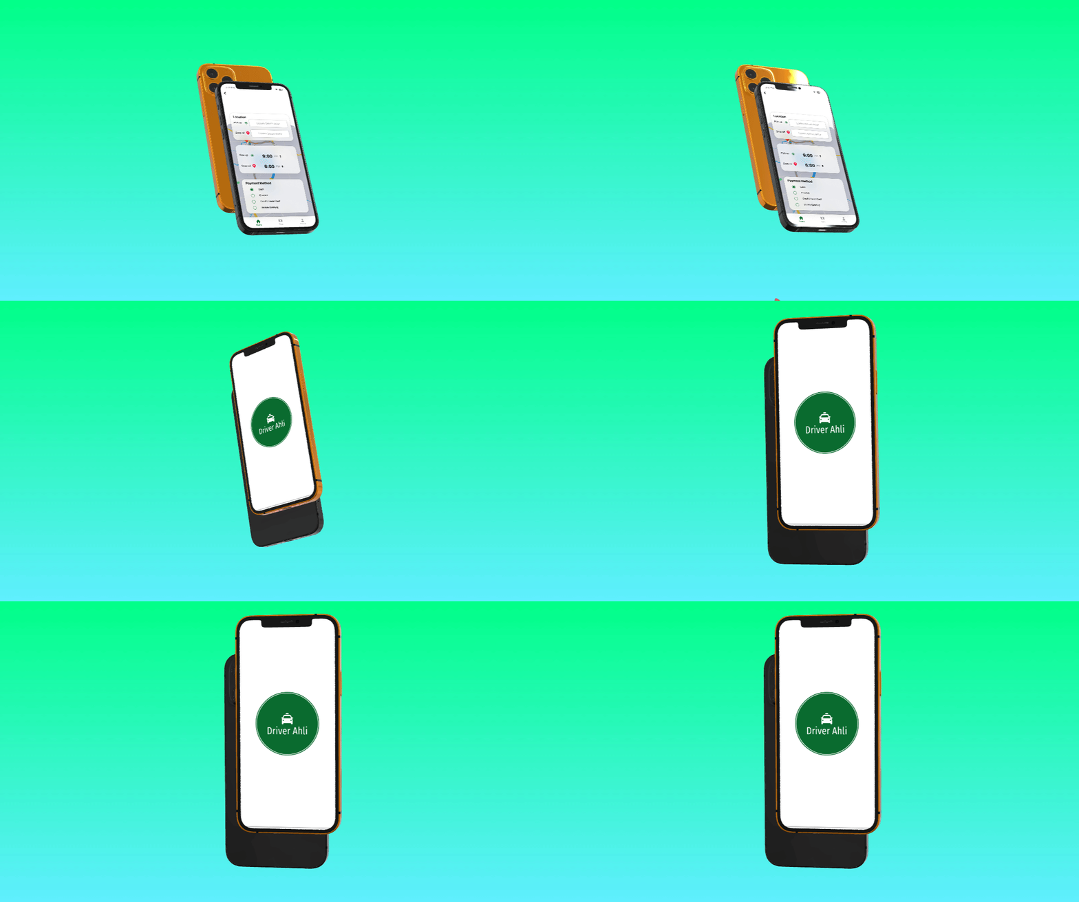
| Service | Deliverables | Links | Status |
|---|---|---|---|
| Mobile App Design | Application | Project Link | Published |
| Interface Design | |||
| User Experience Design | |||
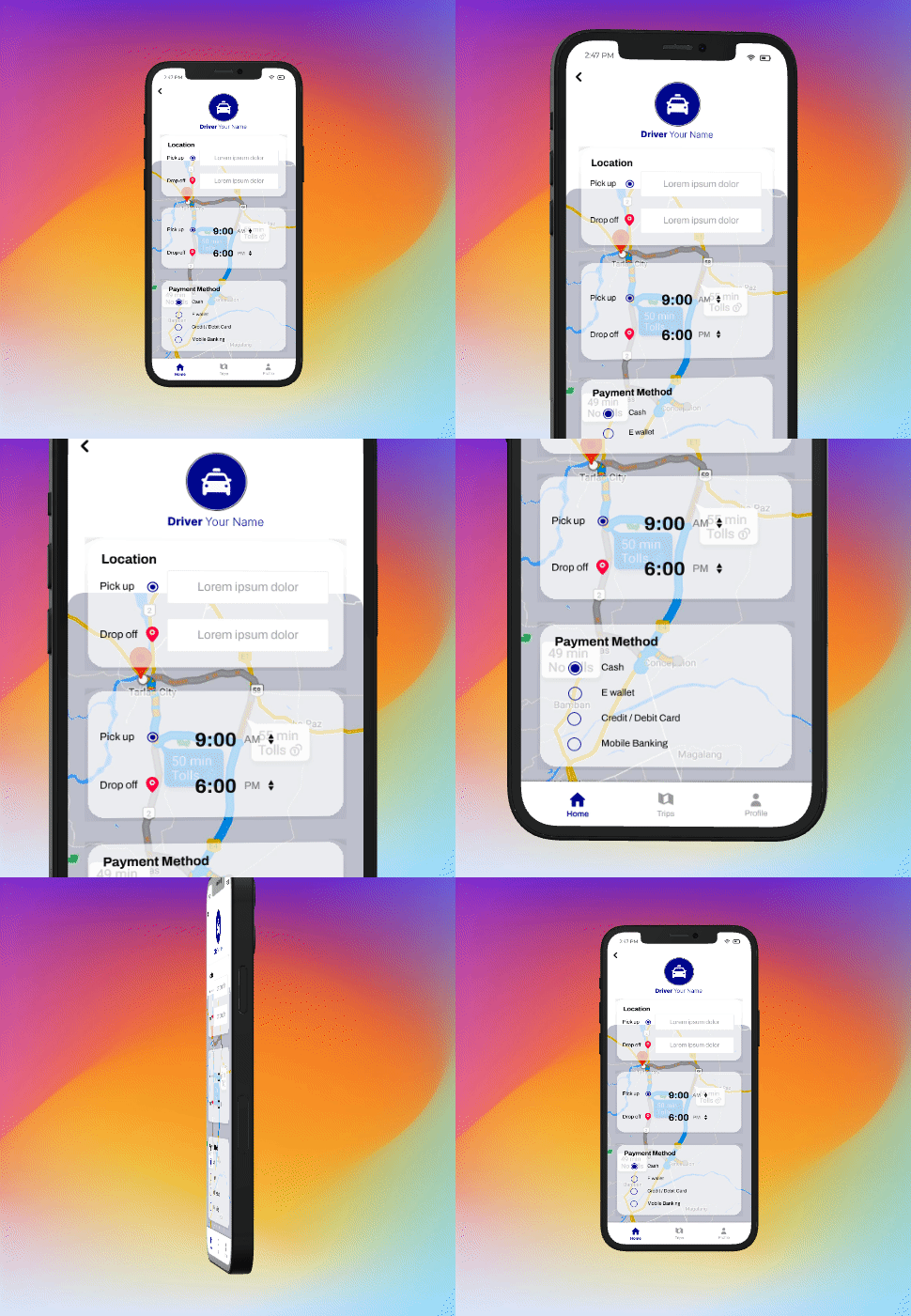
Our audience primarily comprises taxi drivers and individuals engaged in driving businesses. These individuals form the core of our target demographic, encompassing a diverse spectrum of professionals who rely on their vehicles as essential tools for their livelihoods. Whether it's navigating city streets or tra nsporting passengers across long distances, o ur audience seeks reliable solutions and sup port tailored to their unique needs in the r ealm of transportation services.
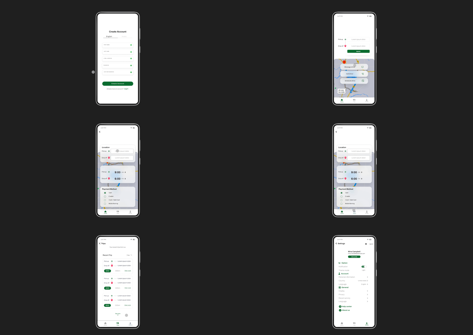
OEmbarking on their journey with our app, users seamlessly initiate their ride bookings w ith effortless convenience. With just a few tap s on their screens, they effortlessly summon tr ansportation tailored to their needs, whether it's a swift ride to the office or a leisurely journey across town. Our interface prioritizes u ser-friendly interactions, ensuring that every step, from selecting pickup points to specifying drop-off locations, is intuitive and hassle-free.
Challenges:
The primary challenge we faced was finding a
way for drivers to maintain control over their
minimum fares without being subject to commissi
ons from third-party companies. This obstacle h
indered drivers' ability to set fair prices for
their services and limited their autonomy within
the transportation industry. It was essential to
address this issue to empower drivers and ensure a
more equitable system for both drivers and passengers.
Solutions:
In response to this challenge, we devised a strategic
solution centered around empowering drivers to take
ownership of the app itself. By implementing changes
to the app's structure and functionality, drivers
gained the ability to control their own ride pricing
and operations directly, without any intermediary
influence. This approach not only fostered autonomy
and flexibility for drivers but also cultivated a
sense of ownership and accountability within the driving community.
Ocaye Ltd.
In our pursuit of excellence, we embrace Enhan ced Collaborative Design, a dynamic approach w here both myself and my manager engage collabo ratively to formulate plans and designs. This method harnesses the collective expertise, ins ights, and perspectives of both parties, leadin g to comprehensive and innovative solutions that address challenges effectively.
In the realm of app development, collaborative innovation is at the forefront of our approach. Myself and the developers work closely together, engaging in iterative discussions and brainstorming sessions to derive actionable strategies for enhancing the app. Through this collaborative process, we leverage the technical expertise of the developers and the domain knowledge and insights that I bring to the table.
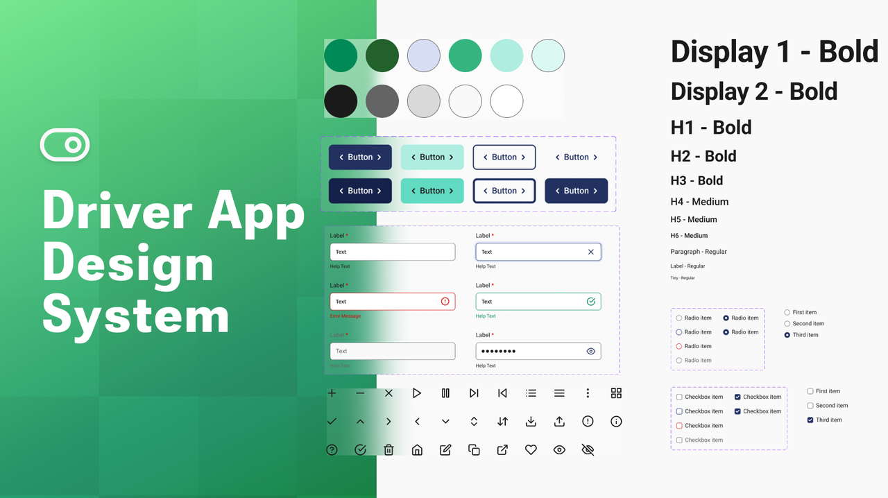
I participated in a team discussion to outline the app's process and features. Collaboratively, we deliberated on the intricate details to ensure a comprehensive approach. Our goal was to enhance functionality and user experience, paving the way for a successful and innovative application.
In the majority of my projects, I typically craft low-fidelity designs to elucidate the user process effectively. These simplified representations serve as a concise yet comprehensive means of conveying the intended user journey and system interactions.
Transitioning from low fidelity, I elevate my design approach to high fidelity, incorporating detailed visual elements, polished aesthetics, and precise interactions. This refined stage ensures a more accurate representation of the final product, offering a comprehensive and visually compelling user experience.
I have crafted a prototype aimed at illustrating the user's journey comprehensively, thereby facilitating developer understanding of the intended functionality. This prototype serves as a tangible representation of the user experience, offering developers valuable insights into the flow and intricacies of the design. Through interactive demonstrations and visualizations, developers gain a clear understanding of user interactions, system responses, and overall user interface dynamics
I've gained a deep understanding of the significance of simplified design in ensuring user comprehension and ease of navigation within the app. By prioritizing simplicity, we enhance user experience, making it more intuitive for users to understand the app's processes and functionalities, ultimately leading to higher user satisfaction and engagement.


| Service | Deliverables | Links | Status |
|---|---|---|---|
| Landing Page Design | Website | Project Link | Published |
| Interface Design | |||
| User Experience Design | |||
| Web Development |
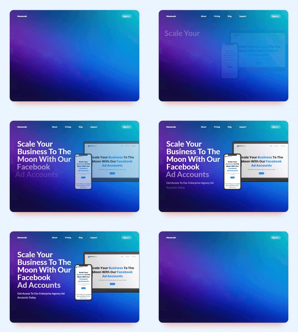
The target audience for this advertising solutions company includes SMBs, startups, and established businesses seeking assistance with scaling on digital ad platforms. Marketing teams and individual entrepreneurs also benefit from their expertise in navigating social media advertising complexities. With over a decade of experience and established contacts, the company offers personalized support to help clients overcome ad spend restrictions, ensure policy compliance, and achieve their digital advertising goals efficiently.
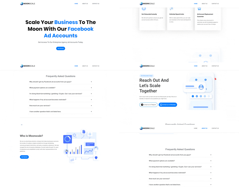
Moonscale Agency
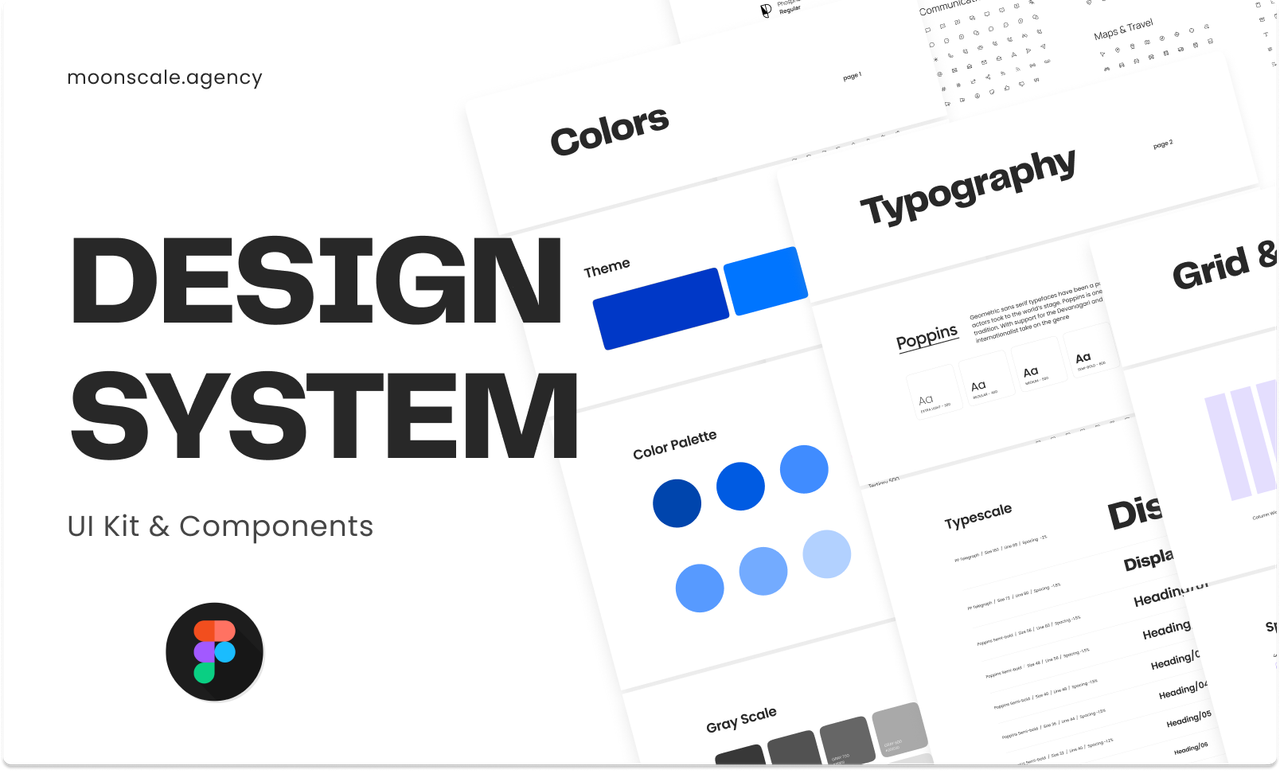
I participated in a team discussion to outline the Website's process and features. Collaboratively, we deliberated on the intricate details to ensure a comprehensive approach. Our goal was to enhance functionality and user experience, paving the way for a successful and innovative application.
In the majority of my projects, I typically craft low-fidelity designs to elucidate the user process effectively. These simplified representations serve as a concise yet comprehensive means of conveying the intended user journey and system interactions.
Transitioning from low fidelity, I elevate my design approach to high fidelity, incorporating detailed visual elements, polished aesthetics, and precise interactions. This refined stage ensures a more accurate representation of the final product, offering a comprehensive and visually compelling user experience.
I am also the one who meticulously crafts complete landing pages for clients, leveraging a combination of CSS, HTML, and JavaScript to deliver a seamless and visually stunning user experience. My service is all-encompassing, providing clients with a comprehensive package at an affordable rate. This includes seamless integration of calendly booking and HubSpot forms, ensuring efficient communication and streamlined workflows for both the client and their customers.
I've gained insights into the significance of ensuring user-friendly website design, prioritizing clarity and simplicity to enhance the user experience. Additionally, I've recognized the importance of maintaining consistency in branding elements such as color schemes, banners, and logos, as they contribute to a cohesive and professional appearance across the platform.


| Service | Deliverables | Links | Status |
|---|---|---|---|
| Admin Side Interface Design Enhancement | Website Application | Project Link | PUBLISHED |
| Interface Design | |||
| User Experience Design | |||
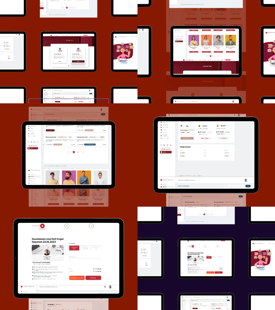
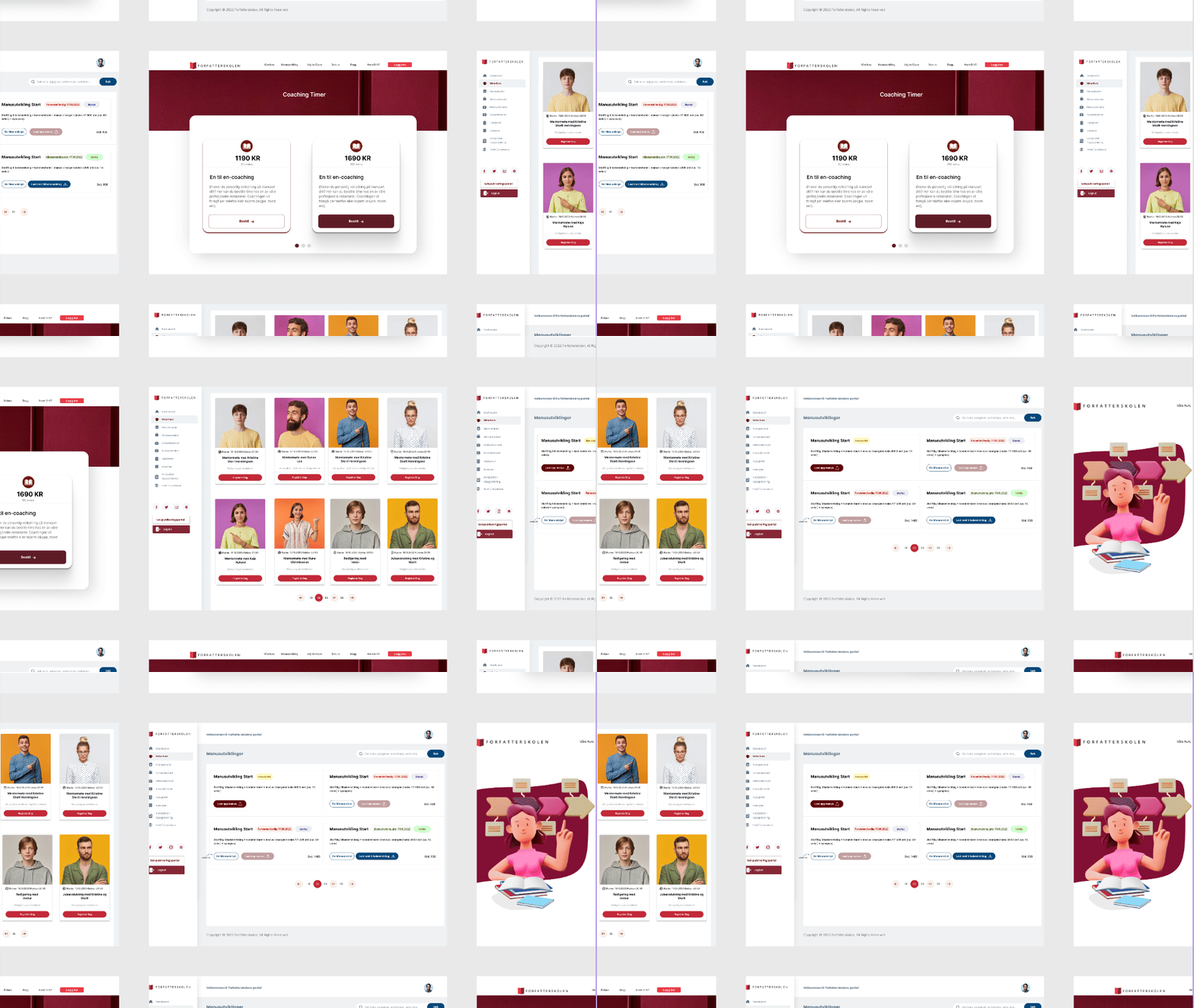
The primary audience of this website comprises writers and individuals eager to share their knowledge and experiences. It also caters to those seeking to publish their books, providing a platform for showcasing their literary works and creative endeavors.
I've initiated a different layout proposal to accommodate the dynamic nature of image uploads. Given that the size of images depends on user preference, the proposed layout aims to offer flexibility and ease of use within the dashboard interface.
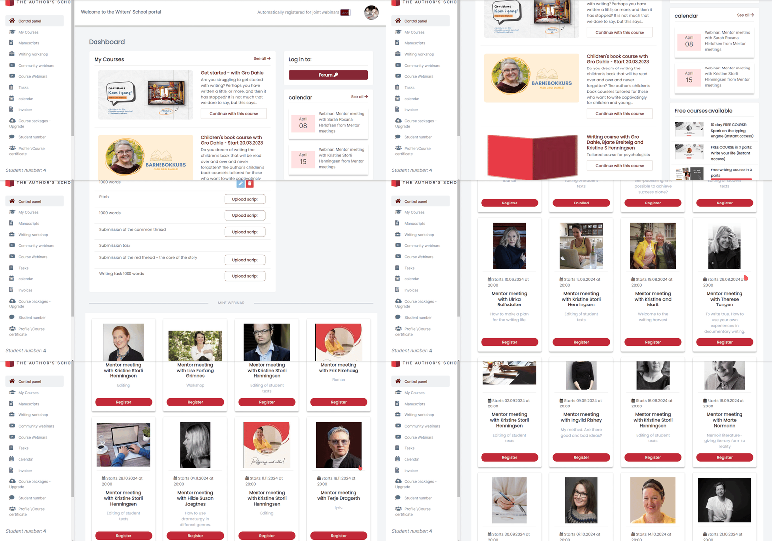
For the courses list, I've implemented the same layout as the dashboard course widget. This consistency ensures that users can navigate seamlessly without confusion about what they're clicking on while accessing the dashboard.
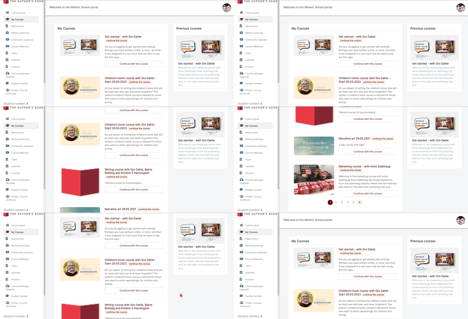
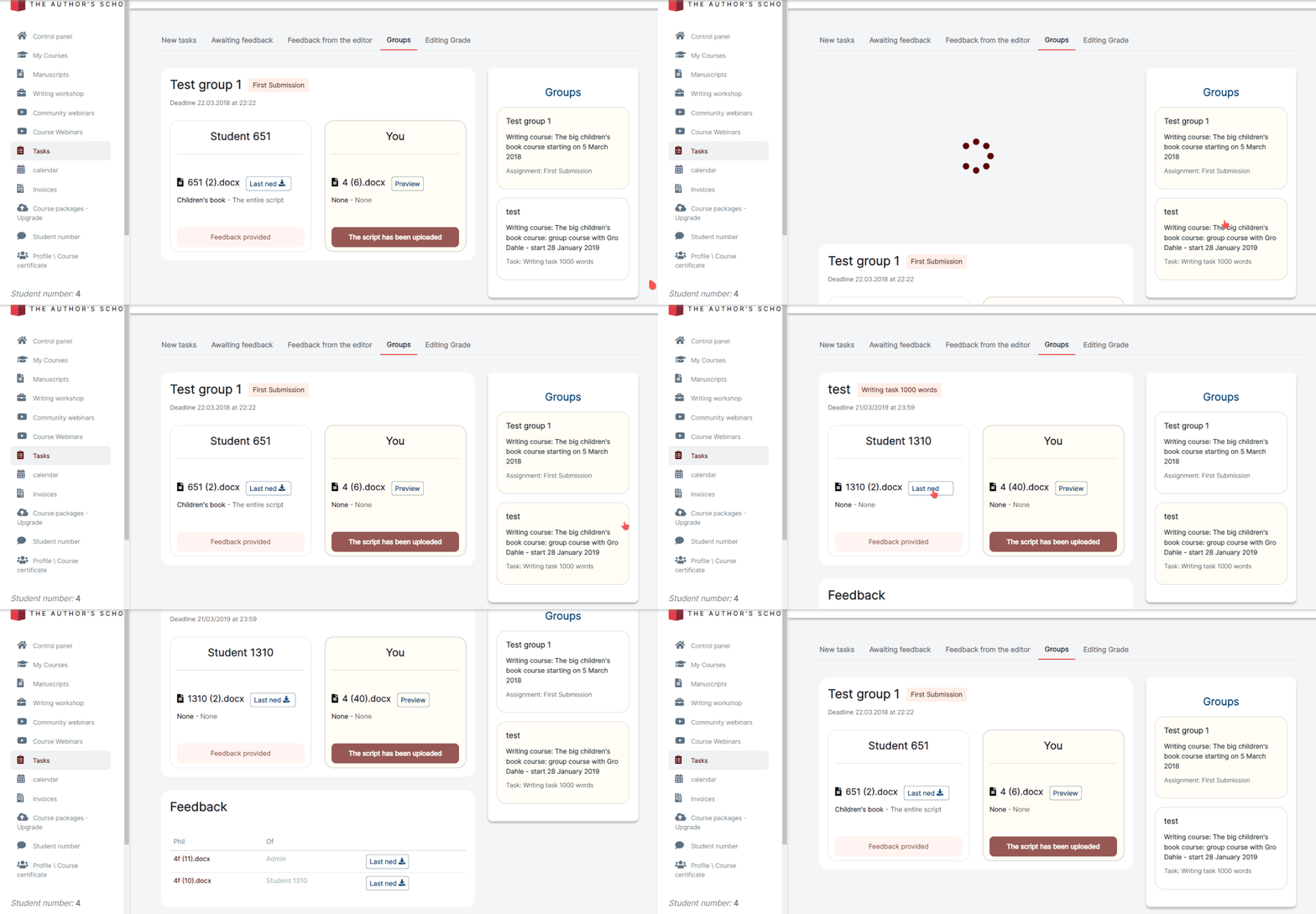
In designing the manuscript list, I took into consideration the demographic of our users, many of whom are elderly or seniors. To cater to their needs, I've crafted a layout that prioritizes clarity and ease of use. By emphasizing clear, legible text and streamlining the presentation, users can effortlessly focus on the list they want without unnecessary distractions.
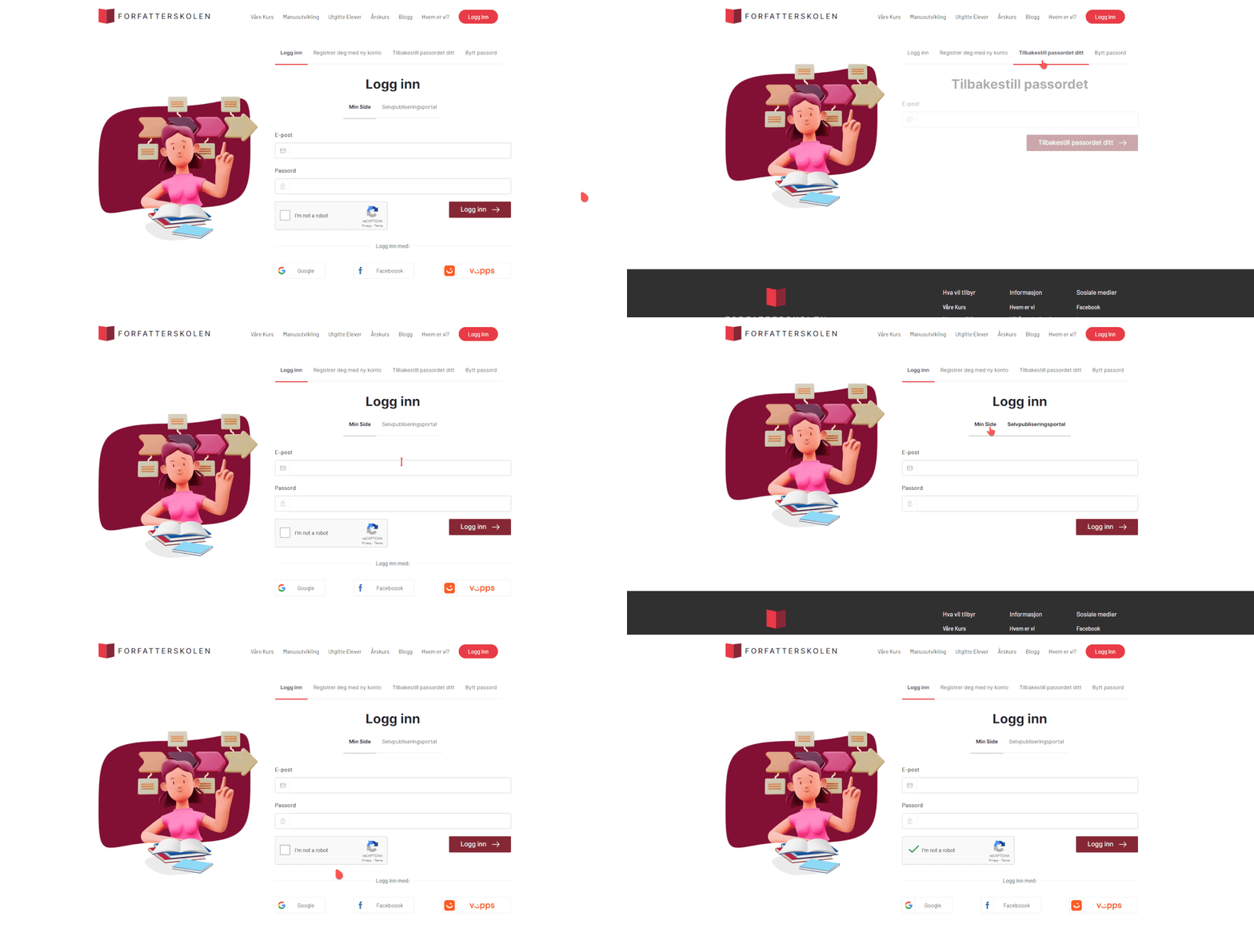
In the login page design, I've crafted a layout that aligns with the diverse needs of our users, providing multiple login options to enhance accessibility. Recognizing the varied preferences and requirements of our user base, this layout offers different methods of logging in, ensuring flexibility and ease of access for all individuals interacting with the platform.
Challenges:
The challenges I encountered revolved around understanding the website's user demographics, particularly their age range, preferences, and how best to tailor the layout to align with their needs. To address these challenges and enhance user experience:
Solutions:
To address these challenges and improve user experience, I adopted a strategic approach:
Conduct thorough user research to gain insights into the demographics, behaviors, and preferences of the website's audience. This may involve surveys, interviews, or analyzing existing user data to understand their age range, technological proficiency, and preferences.
Create detailed user personas representing different segments of the target audience based on demographic information, goals, and pain points. This helps in visualizing and empathizing with users' needs and preferences.
Considering that a significant portion of the user base consists of elderly and senior individuals, prioritize readability, simplicity, and intuitive navigation in the layout. Use larger fonts, clear contrast, and straightforward navigation menus to accommodate users with varying levels of technological proficiency.
Conduct usability testing with representative users from different age groups to gather feedback on the layout and identify any usability issues or areas for improvement. Observing how users interact with the website can provide valuable insights into their preferences and pain points.
Implement an iterative design process, where layouts and features are continuously refined based on user feedback and data analytics. This ensures that the website evolves to better meet the needs and preferences of its users over time. Accessibility Considerations: Ensure that the website meets accessibility standards to accommodate users with disabilities or age-related impairments. This includes providing alternative login methods, such as social media authentication or email login, to cater to users with different needs and preferences.
Conduct thorough user research to gain insights into the demographics, behaviors, and preferences of the website's audience. This may involve surveys, interviews, or analyzing existing user data to understand their age range, technological proficiency, and preferences.
By incorporating these strategies, you can overcome the challenges of catering to a diverse user base and improve the overall user experience on the website.
Author School | Norway
In implementing an enhanced collaborative design process, I initiated an inclusive brainstorming session with stakeholders and team members, fostering creativity and diverse perspectives using skype chats. This led to a productive prototyping workshop where ideas were translated into tangible prototypes, iteratively refined through feedback loops and cross-functional collaboration. User testing sessions were conducted to validate design decisions, ensuring user-centric solutions. Throughout the process, documentation and knowledge sharing facilitated transparency and accountability, empowering the team to contribute effectively. This structured approach maximized synergy, driving innovation and ultimately enhancing the overall user experience.
Conduct thorough user research to gain insights into the demographics, behaviors, and preferences of the website's audience. This may involve surveys, interviews, or analyzing existing user data to understand their age range, technological proficiency, and preferences.
In the majority of my projects, I typically craft low-fidelity designs to elucidate the user process effectively. These simplified representations serve as a concise yet comprehensive means of conveying the intended user journey and system interactions.
Transitioning from low fidelity, I elevate my design approach to high fidelity, incorporating detailed visual elements, polished aesthetics, and precise interactions. This refined stage ensures a more accurate representation of the final product, offering a comprehensive and visually compelling user experience.
I have crafted a prototype aimed at illustrating the user's journey comprehensively, thereby facilitating developer understanding of the intended functionality. This prototype serves as a tangible representation of the user experience, offering developers valuable insights into the flow and intricacies of the design. Through interactive demonstrations and visualizations, developers gain a clear understanding of user interactions, system responses, and overall user interface dynamics.
Through this project, I've gained valuable insights into the importance of pacing and patience in the design process. Rushing through tasks can easily lead to distractions and hinder the quality of the design outcome. Instead, taking the time to carefully consider each step, gather feedback, and iterate on designs results in more thoughtful and effective solutions. This project has underscored the significance of a methodical approach, allowing for thorough exploration and refinement, ultimately leading to better outcomes and a more satisfying user experience.


| Service | Deliverables | Links | Status |
|---|---|---|---|
| Landing Page Design | Website | Project Link | Published |
| Interface Design | |||
| User Experience Design | |||
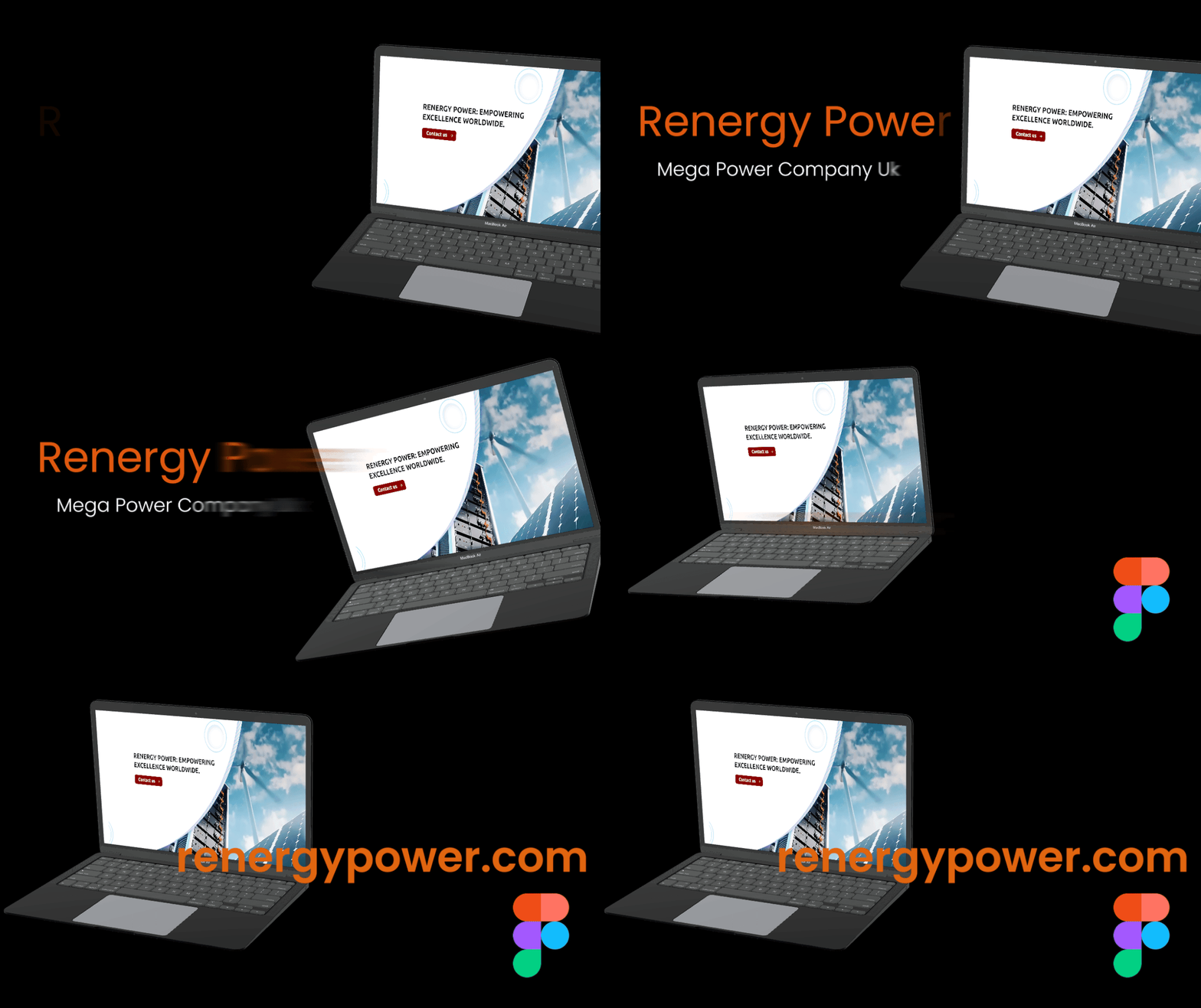
The primary audience of this website comprises individuals seeking to purchase lithium batteries, as well as other variants of lithium-based energy storage solutions. Whether it's for personal electronics, electric vehicles, or renewable energy applications, our platform caters to those in search of reliable and efficient lithium battery options.
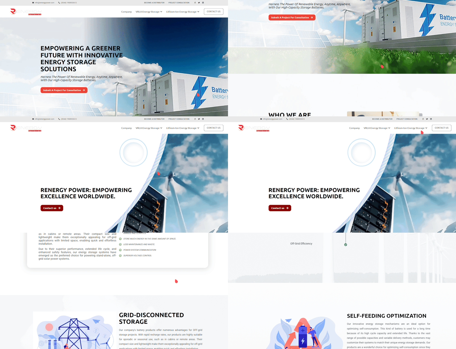
Megapower UK
I participated in a team discussion to outline the Website's process and features. Collaboratively, we deliberated on the intricate details to ensure a comprehensive approach. Our goal was to enhance functionality and user experience, paving the way for a successful and innovative application.
In the majority of my projects, I typically craft low-fidelity designs to elucidate the user process effectively. These simplified representations serve as a concise yet comprehensive means of conveying the intended user journey and system interactions.
Transitioning from low fidelity, I elevate my design approach to high fidelity, incorporating detailed visual elements, polished aesthetics, and precise interactions. This refined stage ensures a more accurate representation of the final product, offering a comprehensive and visually compelling user experience.
As part of the design process, I've created a prototype to demonstrate the banner interaction on our car rental website. In this prototype, users can see how the banner smoothly transitions between different promotional offers or important announcements. By clicking on the banner, users can access more details or take action, such as booking a car or exploring available subscription p lans. This interactive feature enhances user engagement and f acilitates seamless navigation, providing a more intuitive and dyna mic browsing experience for our website visitors.
I've gained insights into the significance of ensuring user-friendly website design, prioritizing clarity and simplicity to enhance the user experience. Additionally, I've recognized the importance of maintaining consistency in branding elements such as color schemes, banners, and logos, as they contribute to a cohesive and professional appearance across the platform.


Part-time |
Remote
As a dedicated website designer specializing in the dental and restaurant industries, I create visually appealing and user-friendly websites tailored to meet the unique needs of these sectors. My design philosophy centers around crafting seamless, intuitive experiences that not only enhance brand presence but also engage and convert visitors. With a deep understanding of the specific requirements and aesthetics of dental and restaurant websites, I bring a blend of creativity and functionality to every project, ensuring that your online presence reflects the quality and professionalism of your business.
Fulltime |
Remote
Formulated and executed comprehensive strategic plans
encompassing both web and app development, tailored to meet
the unique needs of a wide array of client businesses.
Demonstrated effective collaboration as a liaison between
management and developers, fostering a synergistic
relationship to ensure seamless project execution. Pioneered
and led design initiatives, playing a pivotal role in the
conceptualization and creation of visually captivating banners
and compelling social content that left a lasting impact on
target audiences.
Contract |
Remote
Revamped the entire company website using Figma, Photoshop,
and online design tools to enhance its aesthetic appeal,
functionality, and user experience. The result is a polished
and sophisticated online platform, reflecting a modern and
engaging digital presence for the company.
Part-time |
Remote
In my role, I led a significant overhaul of the entire
system's user experience, including a redesign of the 66-page
user portal. Before my involvement, the system had 9,000 users
over five years. Following my onboarding, we achieved a rapid
increase to over 1,000 users in just 1.5 months through
innovative design strategies. I established a strong
collaborative effort with the in-house programming team,
ensuring a seamless integration of design and technical
expertise. This approach enhanced project efficiency and
resulted in a high-quality product that surpassed user
expectations.
Part-time |
Remote
We collaborate closely with clients, actively contributing to
web design projects. Our role involves crafting visually
stunning websites tailored to the unique preferences of each
client, ensuring both aesthetic appeal and functionality.


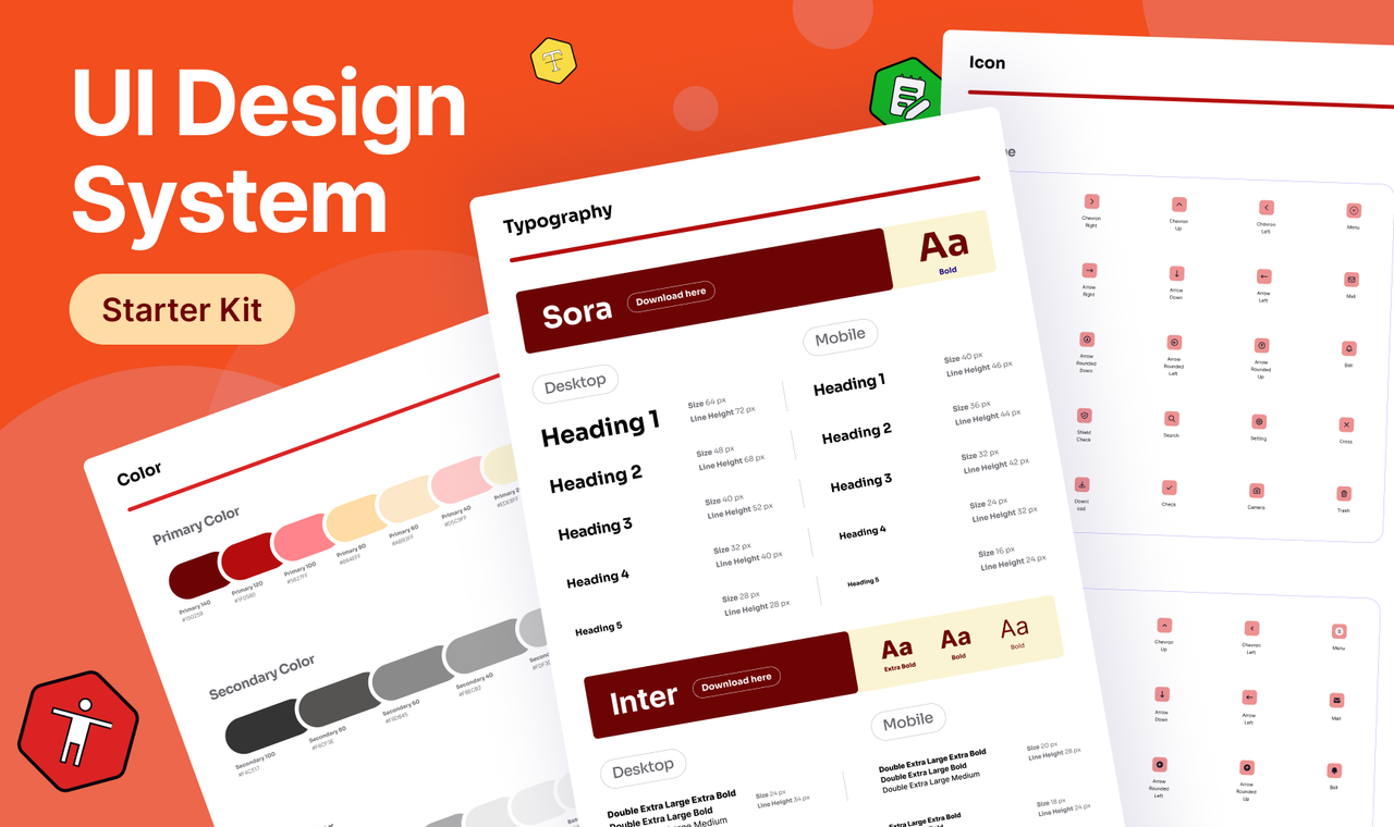
Discover my portfolio showcasing three years of crafting user-centered digital products as a UI/UX designer from the Philippines.
Seamlessly blending aesthetics with functionality, I create engaging digital experiences that prioritize user satisfaction.
